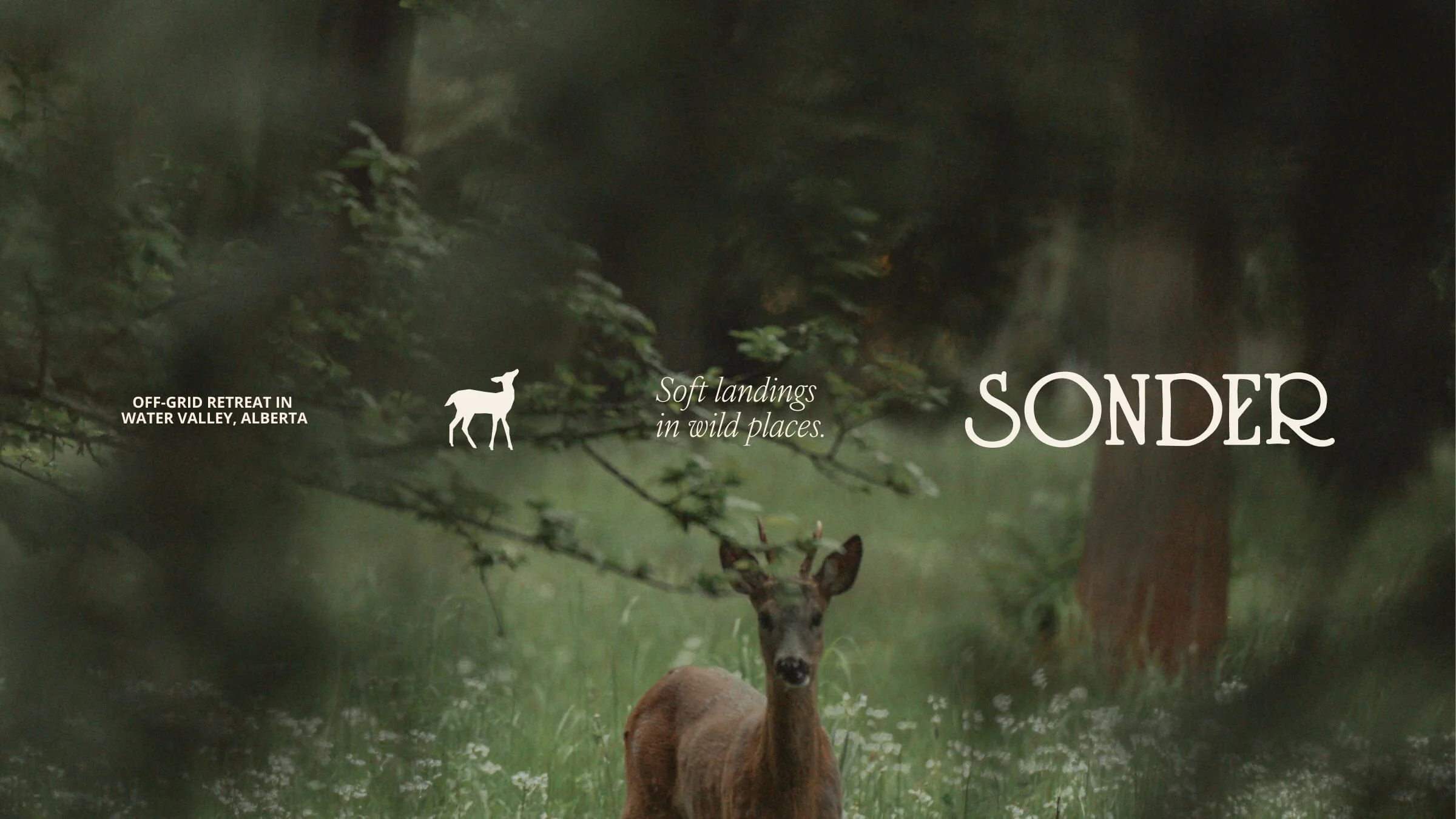
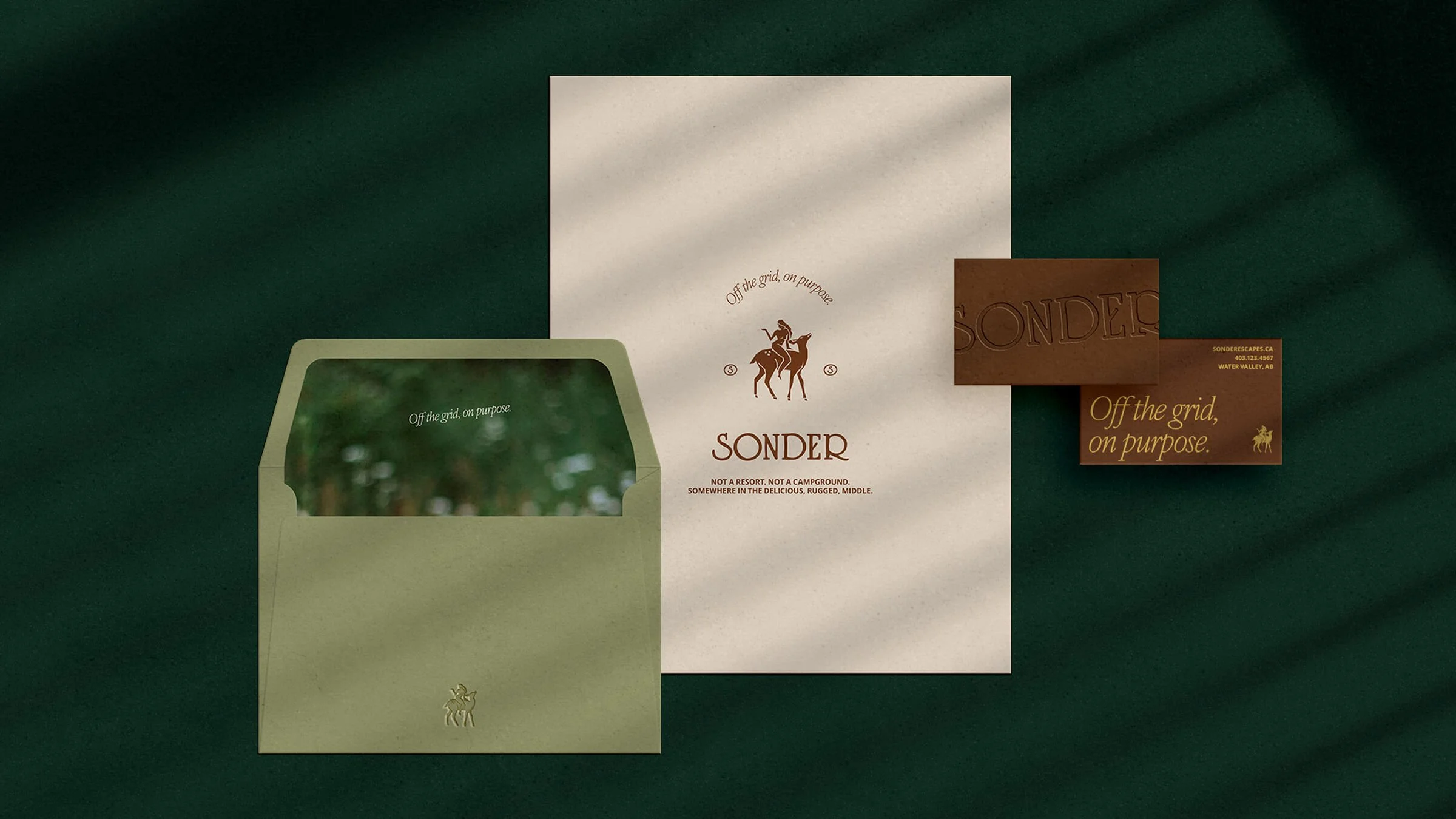
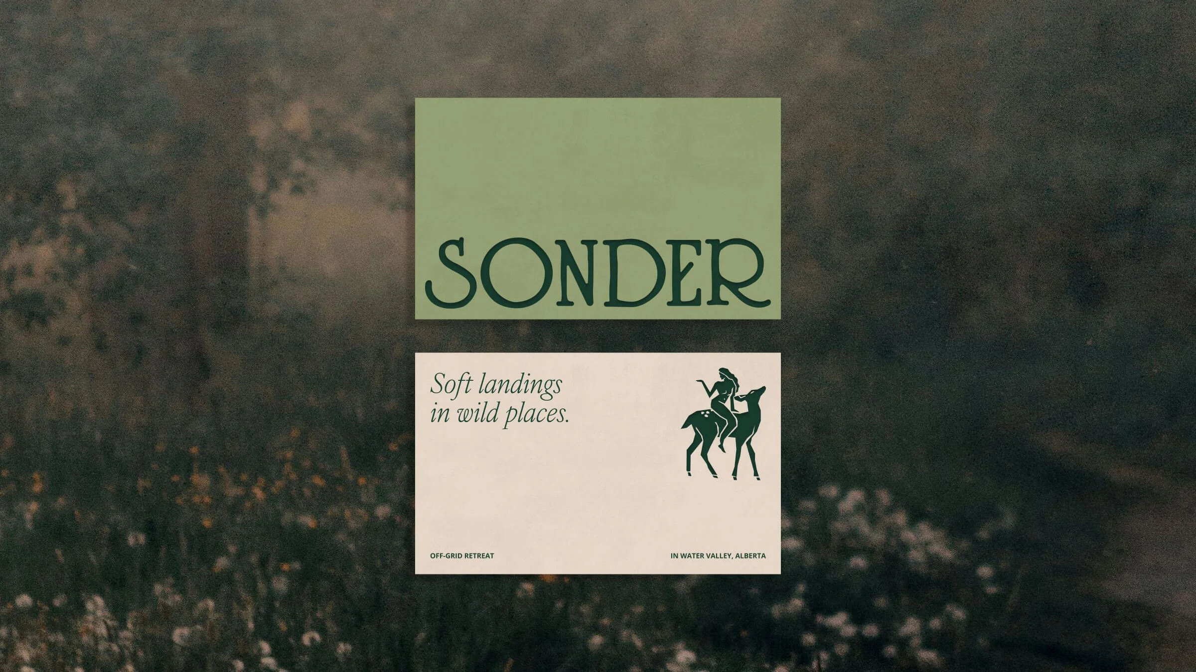
Sonder
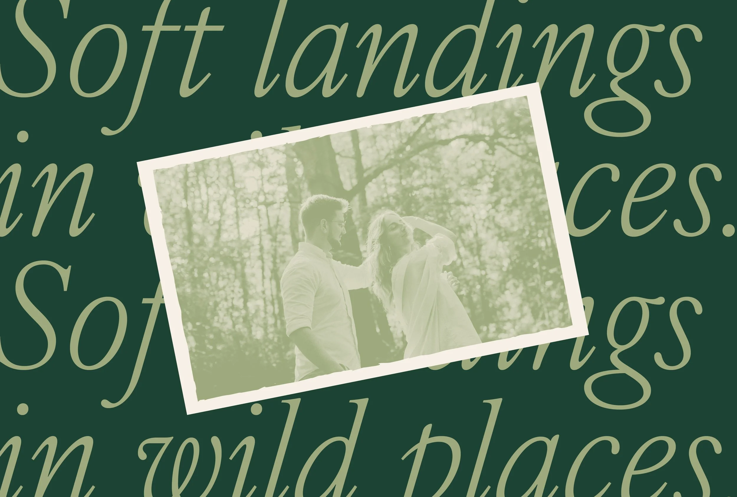
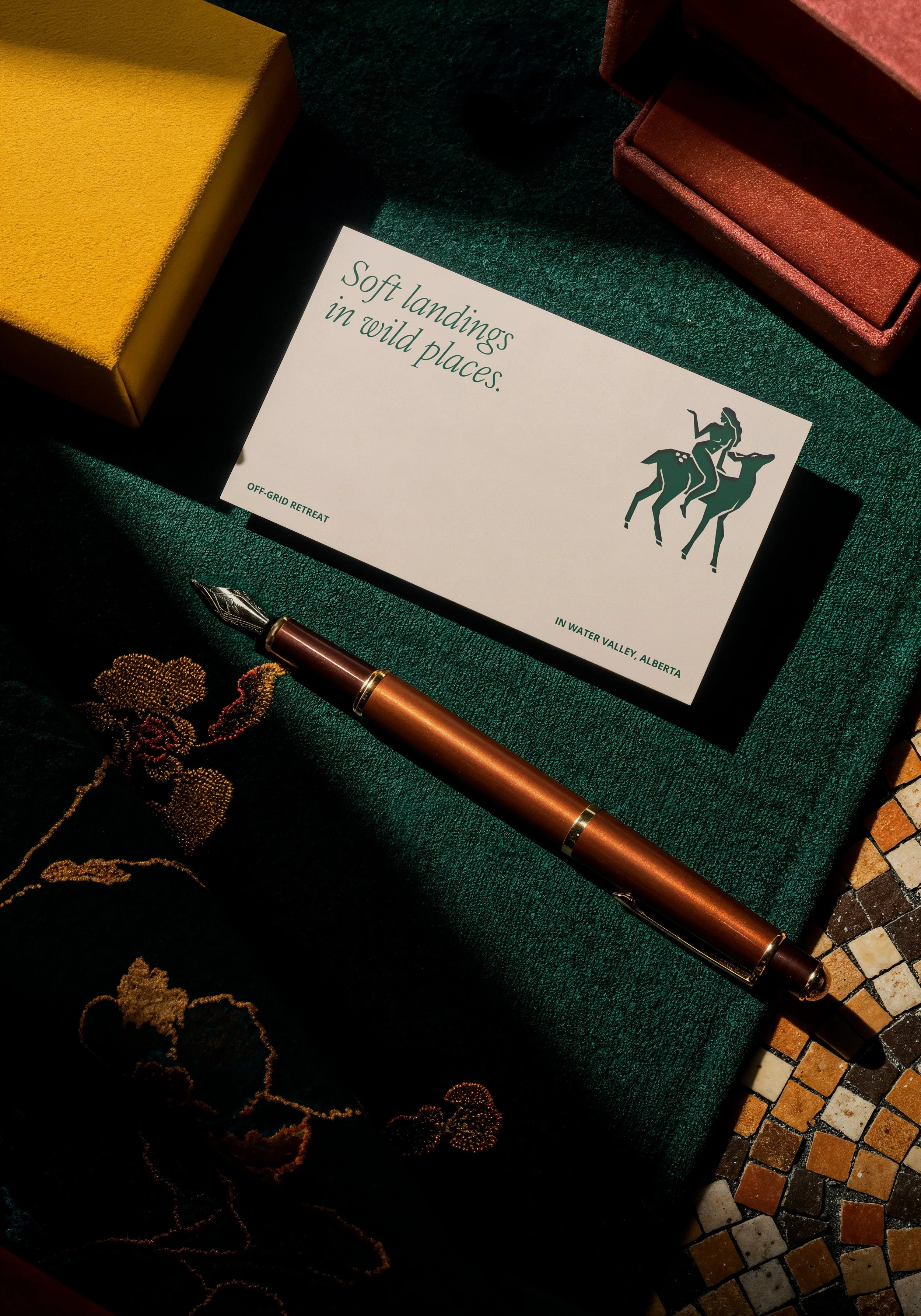
Sonder is a glamping experience rooted in the quiet beauty of Alberta’s landscape—open sky, forest, and water. The brand reflects the balance between wilderness and comfort, offering guests a chance to step away from routine and reconnect with nature through a calm, intentional stay.
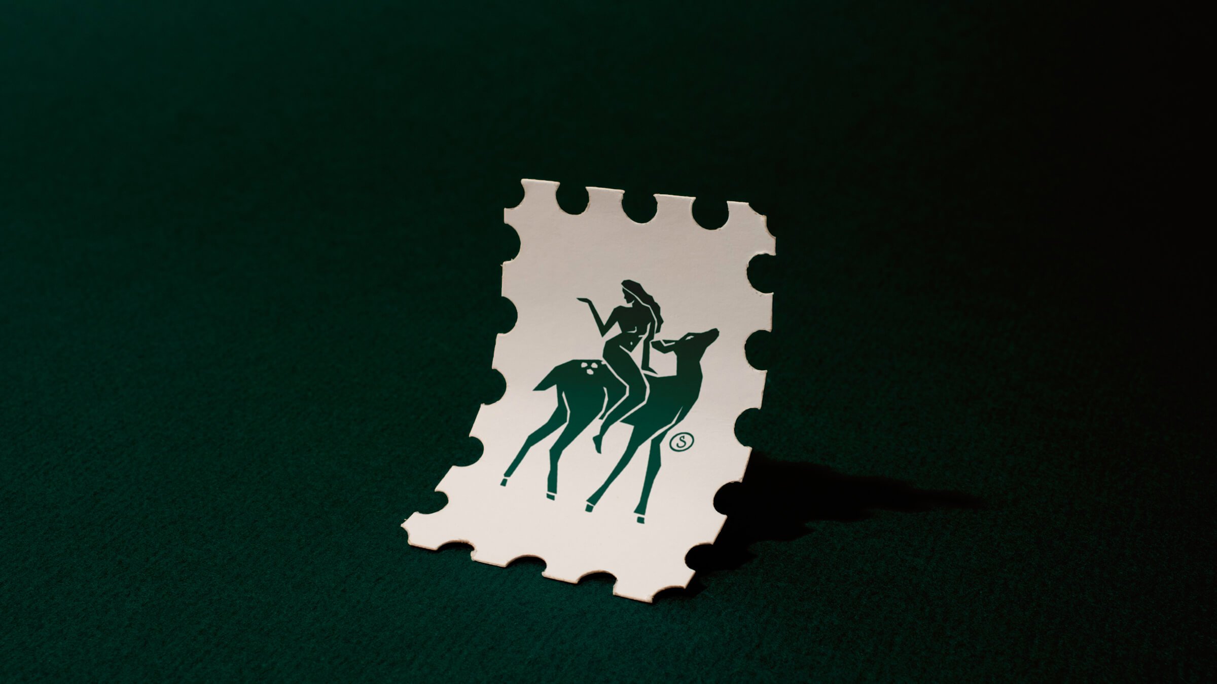
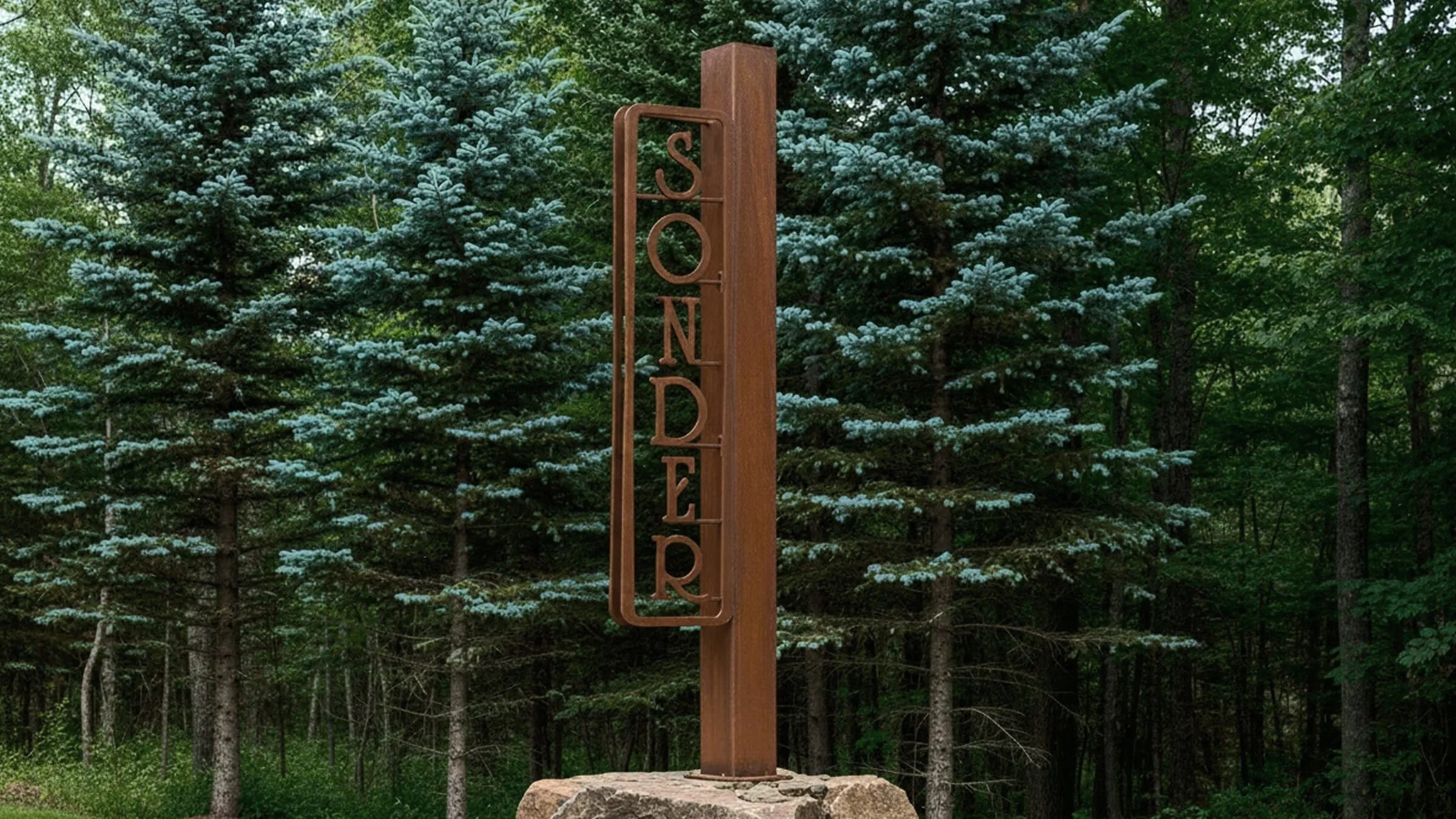
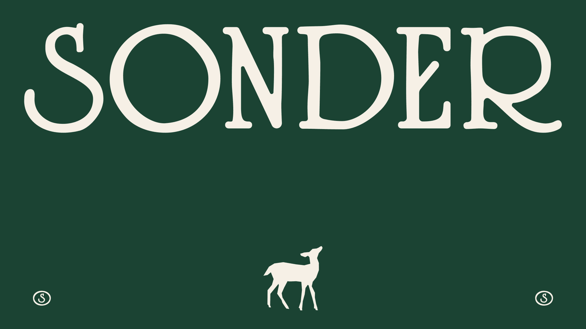
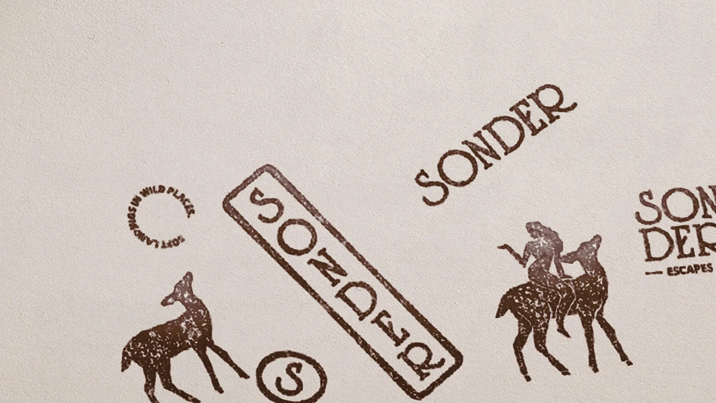
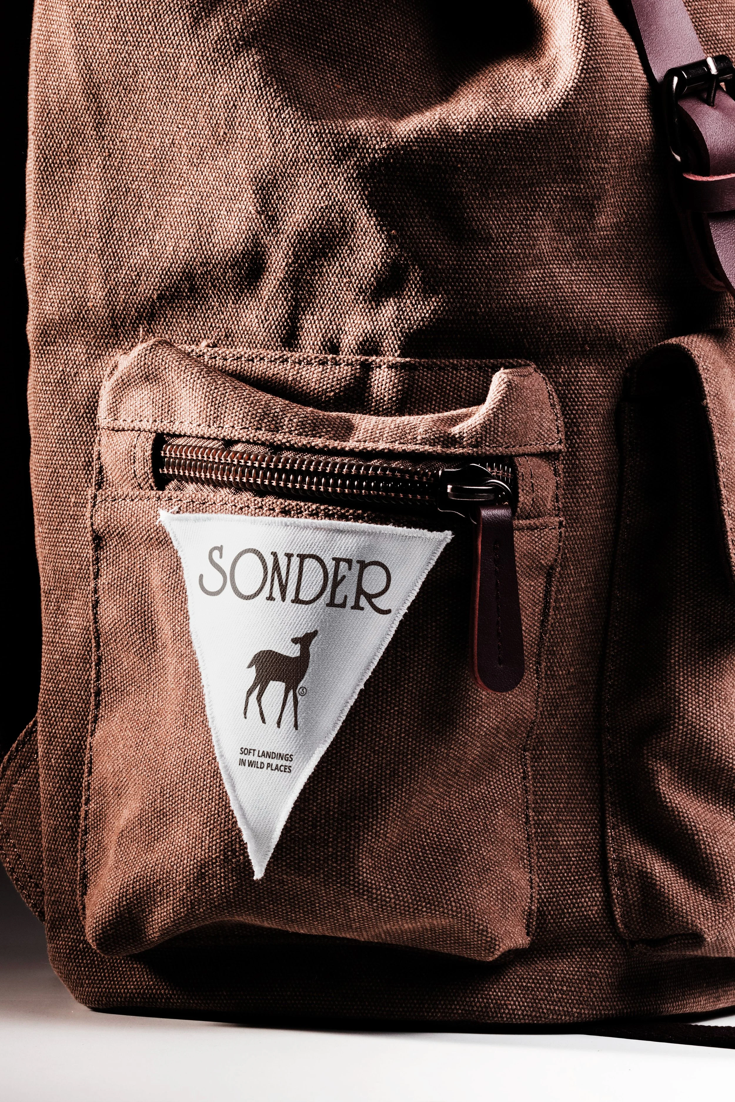
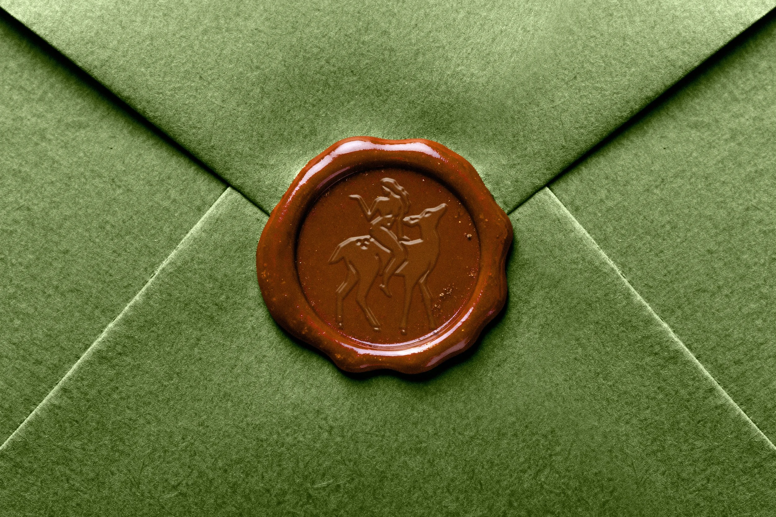
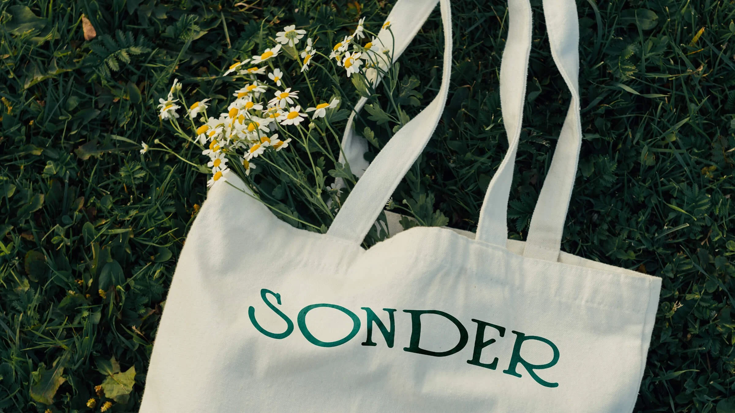
The identity embraces simplicity and restraint, allowing the environment to remain the focus. A spacious typographic system conveys stillness and clarity, while the wordmark’s gentle irregularities suggest something lived-in rather than polished: intentional, grounded, and at ease in its surroundings. Linocut-style illustrations act as quiet markers throughout the brand, adding a handcrafted quality that reinforces Sonder’s grounded, timeless connection to place.
-
Naming, Brand Identity, Motion, Print Asset Design
-
Grant, 2025
-
Aislinn Grant
Creative Direction