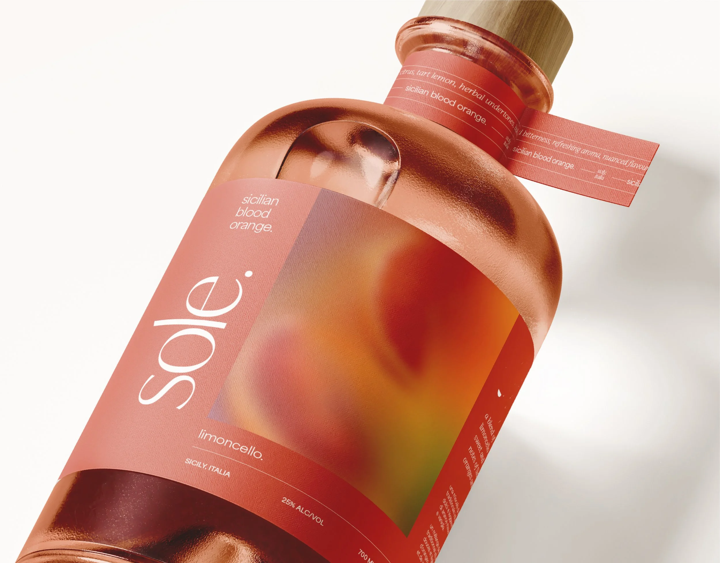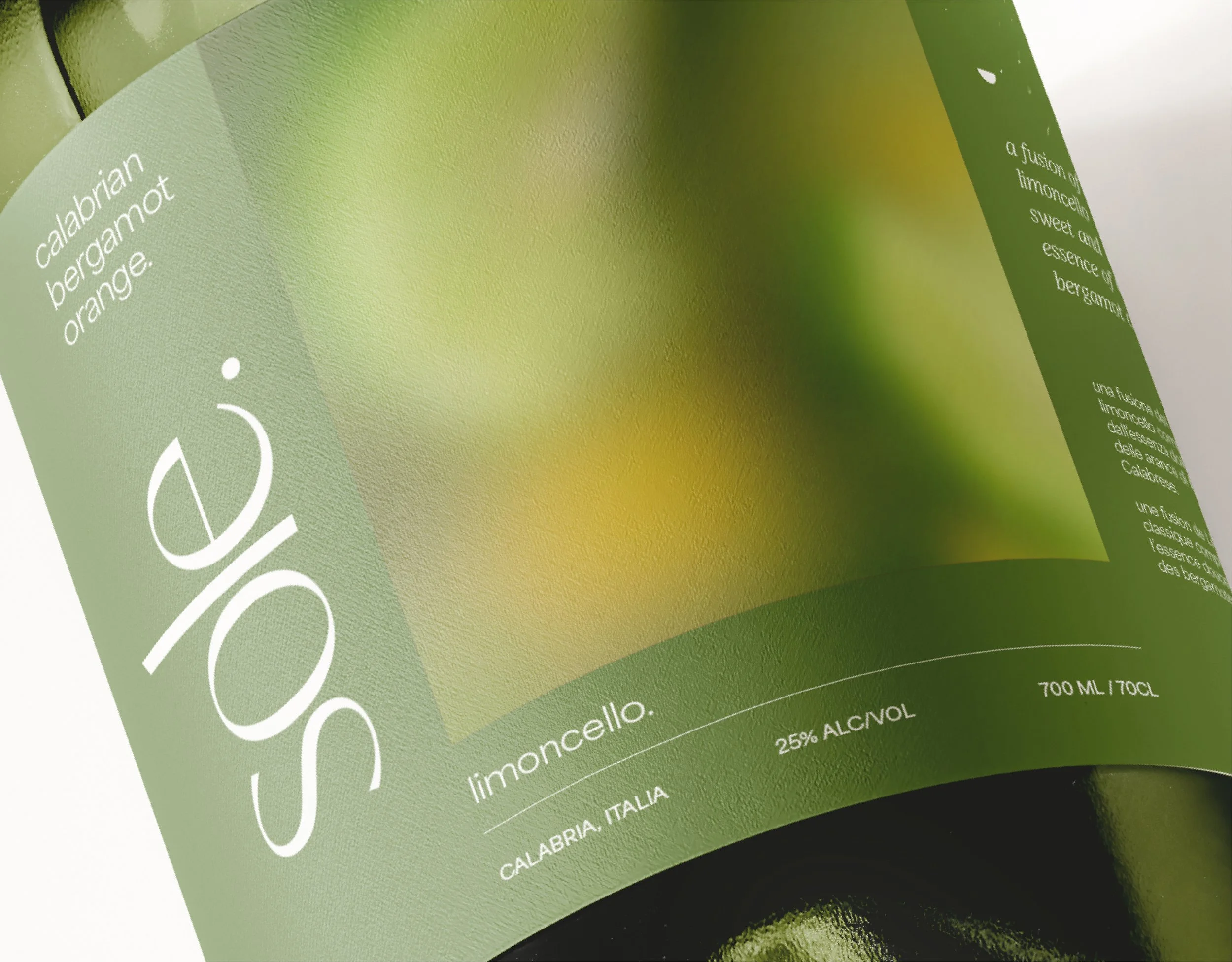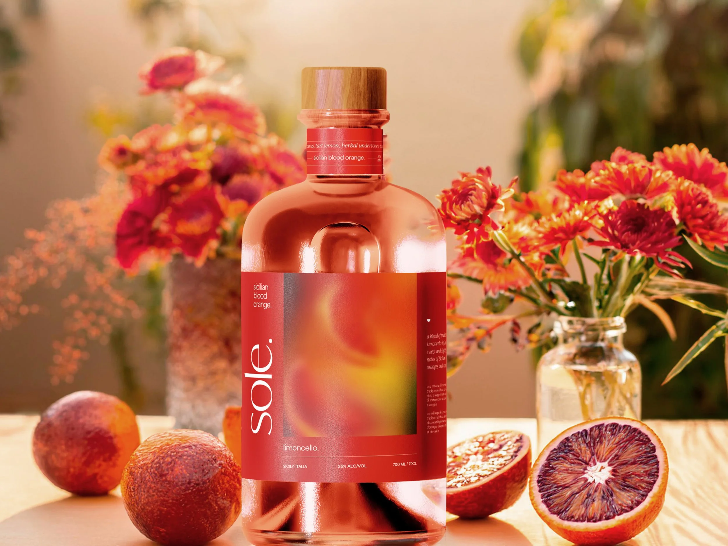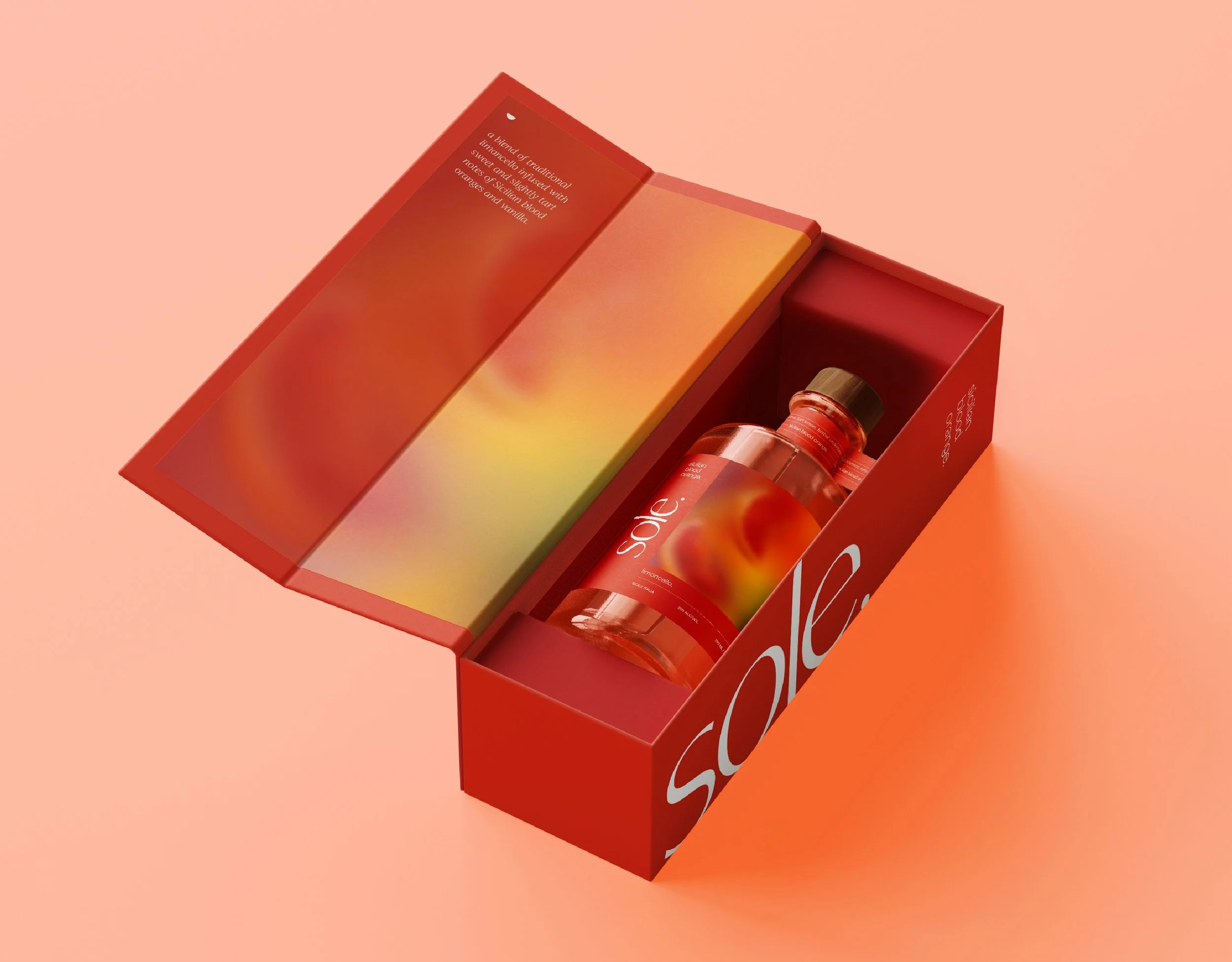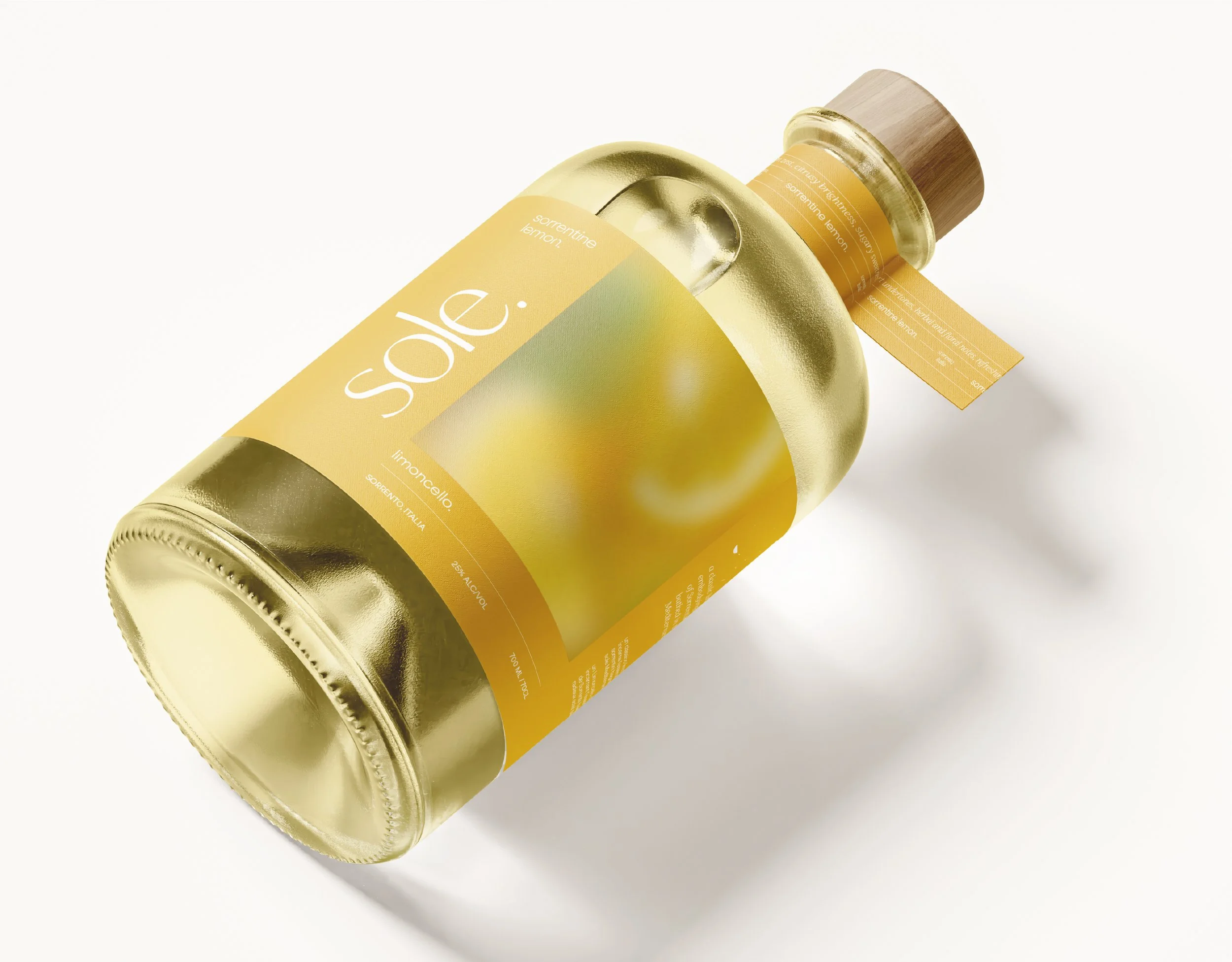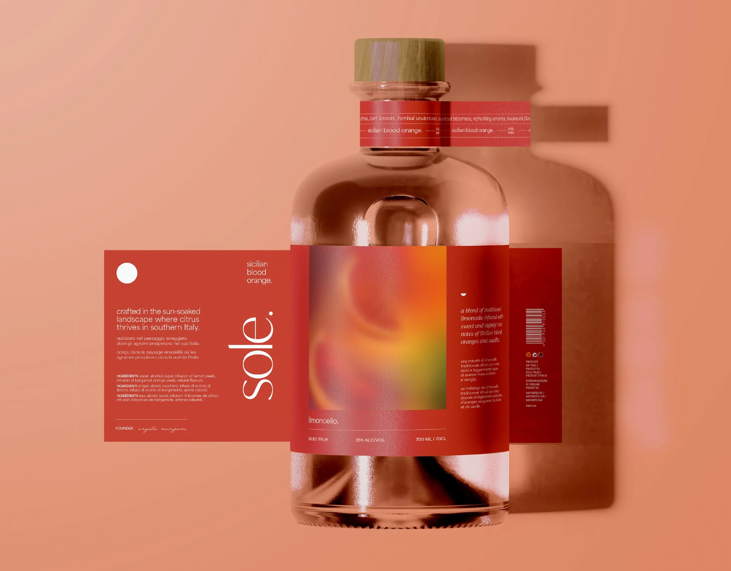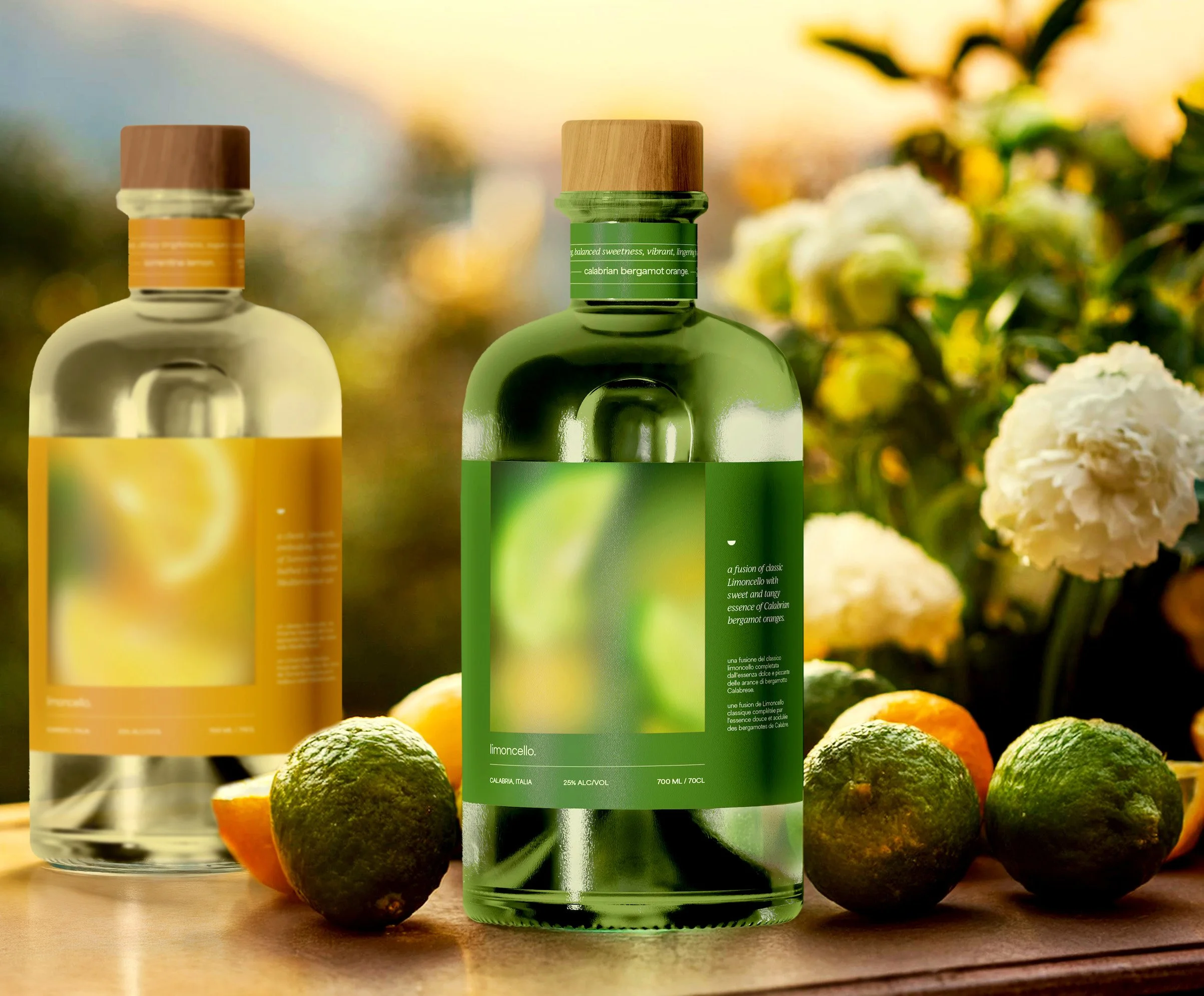
Sole Limoncello
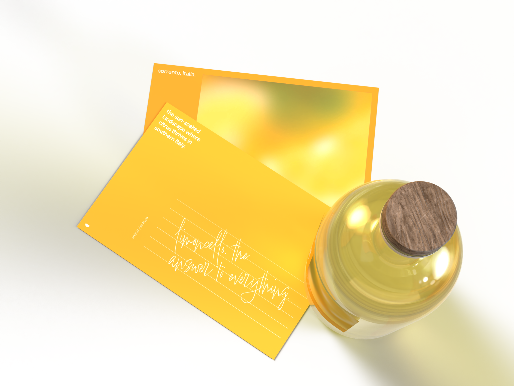
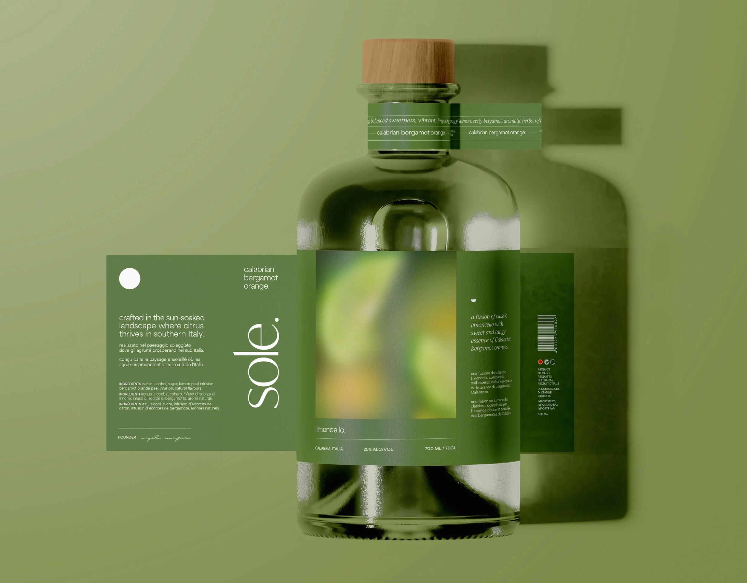
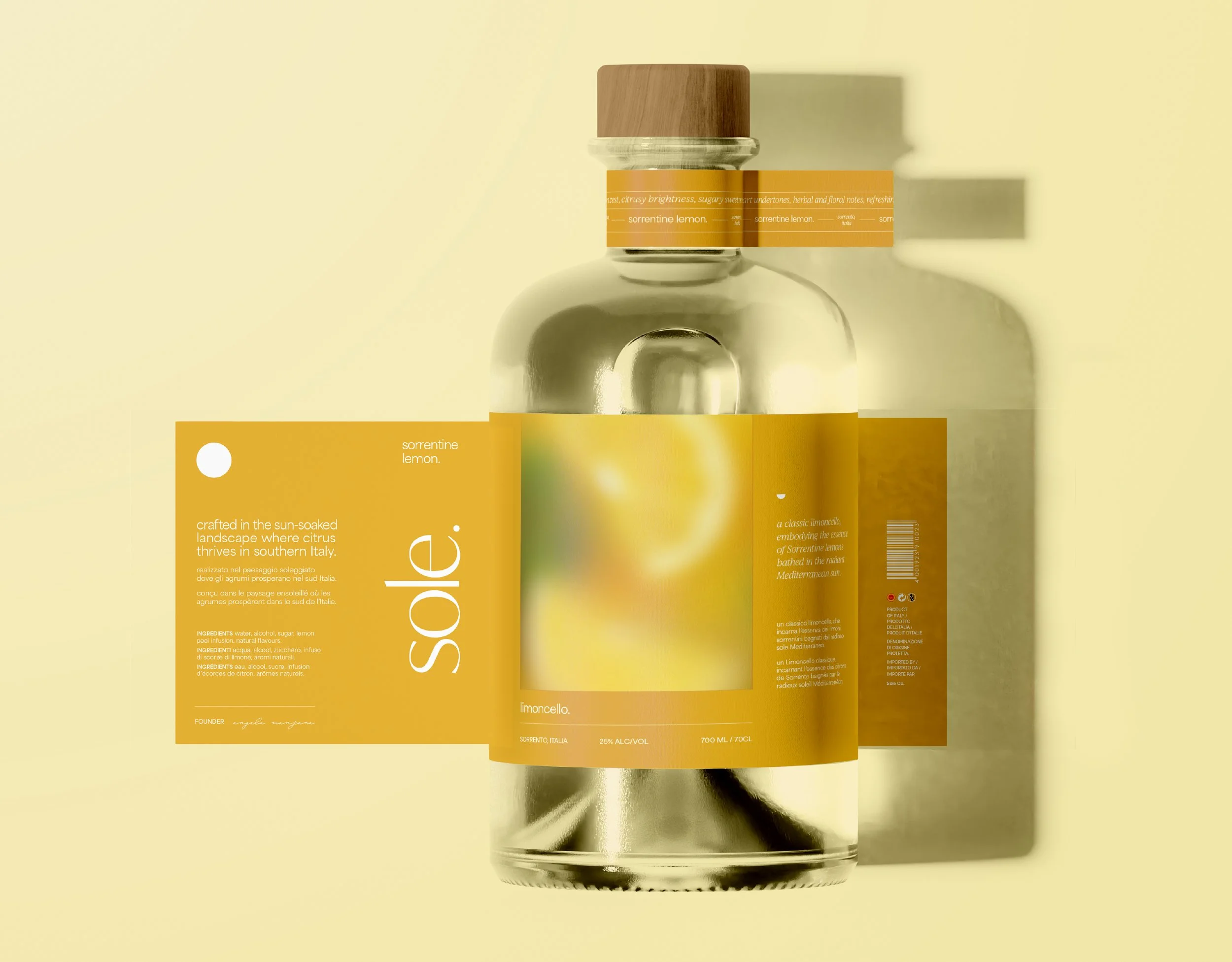
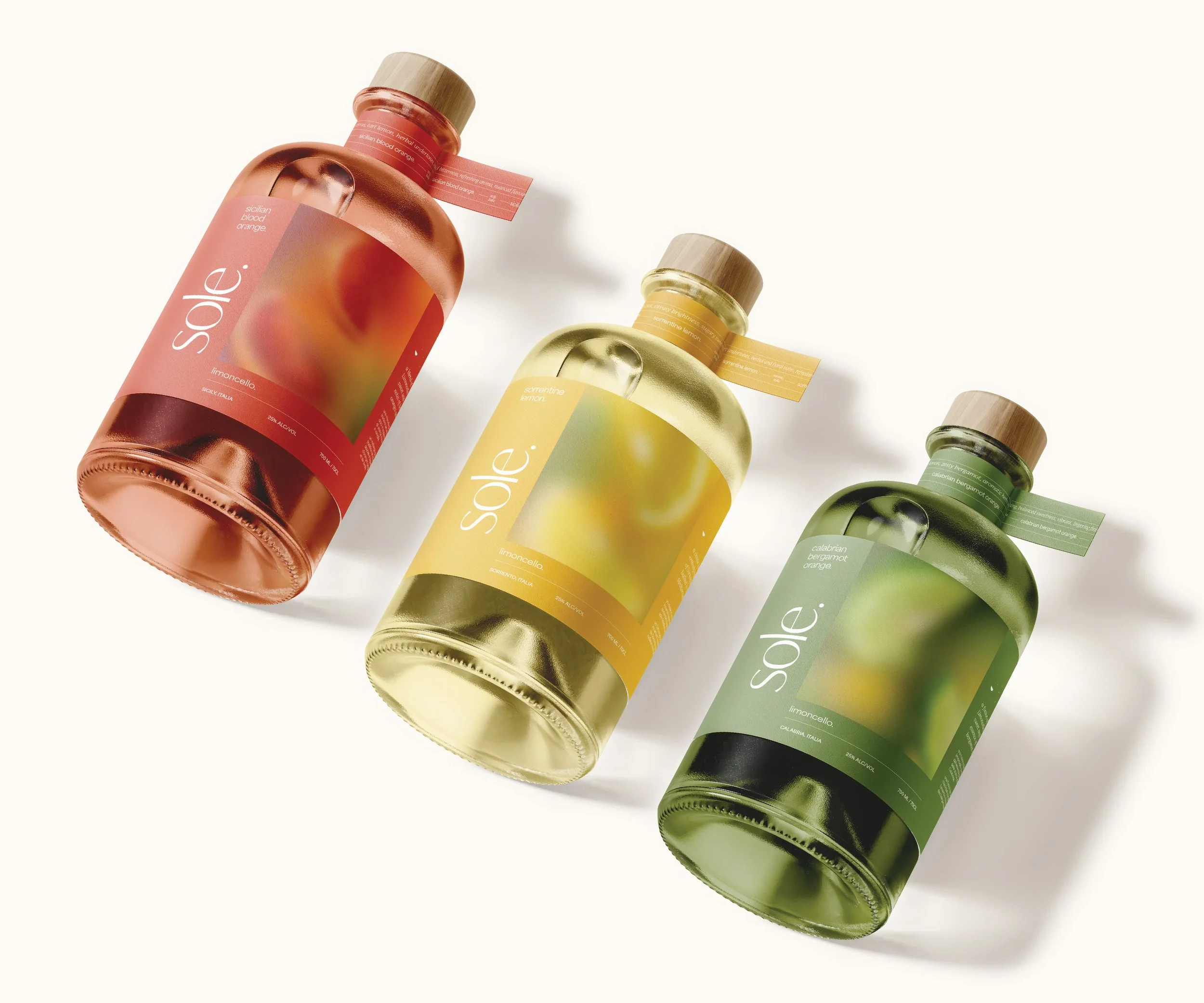
Sole reimagines limoncello by celebrating a wider spectrum of Southern Italian citrus. Inspired by the landscapes of Sorrento, Calabria, and Sicily, the range includes three varieties: Sorrentine Lemon, Calabrian Bergamot Orange, and Sicilian Blood Orange, each highlighting a distinct regional flavour. The label system pairs unique colours and blurred citrus artwork with clean, structured typography, while circular forms subtly reference citrus shapes and maintain visual cohesion across the range.
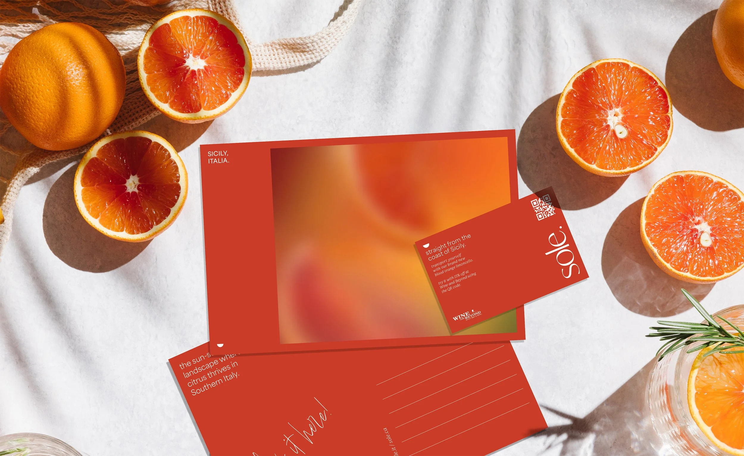
The launch concept extends the brand through a postcard-based direct mail campaign. Featuring the same atmospheric artwork and regional cues, the tactile format reinforces the authenticity of the ingredients and evokes the feeling of receiving a message from abroad, positioning the liqueur as a small portal to place, memory, and flavour.
-
Packaging, Brand Identity, Naming, Ad Launch
-
AUArts, 2024
-
Young Ones Finalist
(Young Ones ADC - Packaging Design)Applied Arts Student Award
(Packaging Design – Series)Featured on The Dieline – read the article here